CASE STUDY: LINERS
60% Boost in Conversion Through UX Optimization
eCommerce shop that sells custom car boot liners for 500+ models. I simplified a complex configuration flow to remove friction and turn high-intent traffic into customers.

Add to Cart Rate Increased

Conversion Rate Growth
Research showed that customers loved the product. But, they struggled with buying it
Most users dropped off long before checkout, not during it. The issue isn’t the price or the product: it’s the cognitive load of the configurator.
MY ROLE INCLUDED:
Senior Product Designer responsible for:
- UX Diagnostic Analysis
- Research Synthesis
- Wireframes
- UI Design System Foundations
- Visual Design
- Client & Developer Collaboration
- Design Handoff
TEAM:
Strategist, Digital Marketing, Developers, PM
Heuristic Evaluation & Key UX Issues
Based on Nielsen Norman Group’s Heuristic Evaluation principles. Condensed to highlight the most impactful issues.
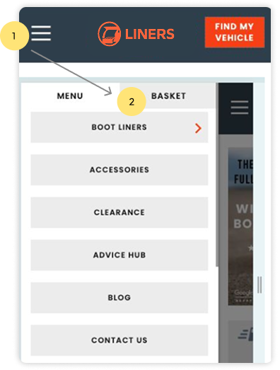
Basket is hidden inside the mobile menu
Finding:
The basket is placed inside the hamburger menu, so users need two taps and must scan the entire menu to find it
Impact:
Users can’t proceed to checkout until they locate the basket, which slows down the journey, adds unnecessary friction and makes a key action in a buying process harder to access
High Cognitive Load
Finding:
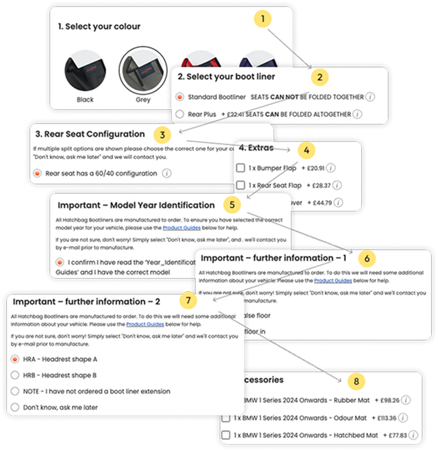
The configurator required eight separate steps, with no progress feedback and poor grouping of decisions.
Impact:
Overwhelm, early abandonment, repeated mistakes
Lack of Clarity
Finding:
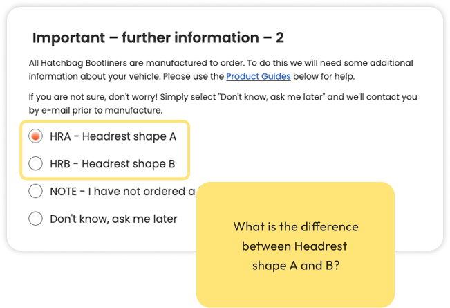
Labels like “Headrest A vs B” didn’t mean anything to users. Users had to read long descriptions, open PDFs and scroll up/down just to understand what they were choosing.
Impact:
Slowed decisions, confusion, misconfigurations
Brand Story Missing
Finding:
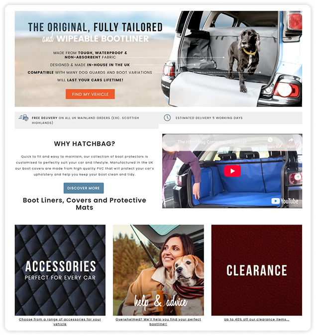
The previous design didn’t allow the brand to express its story or connect with its core audiences. The UI lacked emotion and a way to highlight key product benefits like durability, custom fit and protection
Impact:
Important content blended in with secondary elements, making the product feel purely functional instead of premium, trustworthy and lifestyle-aligned
UX Diagnostic Analysis
informational arhitecture
BEFORE:
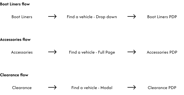
Key issues with the previous IA:
- Three separate flows leading to the same product type that created fragmented experience across all product categories
- Each flow used a different pattern (dropdown, page, modal)
- Users had to repeat vehicle selection every time they wanted to see another category
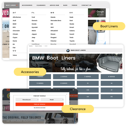
NOW:

How the new IA solves these issues:
- One global vehicle selection replaces all three separate flows
- A single, consistent pattern (landing page) removes dropdown/page/modal confusion
- Vehicle selection stays persistent in the header, preventing repeated inputs
- The new structure supports scalable SEO (optional unique landing pages per vehicle model)
Research Synthesis
Voice of Customer (VoC) Insights
- Ordering Difficulty: Users struggle with configuration.
- Visual Ambiguity: Users aren’t sure what they are buying
Internal Stakeholder Insights
Complex Configurator: Unclear steps and zero visual feedback.
Broken Hierarchy: Technical specs are buried on PDPs.
Funnel & Abandoned Cart Analysis
Low add to cart rate: 3.5%
(vs 7% eCommerce benchmark rate)
Most users dropped off long before checkout, not during it.
Verdict: The issue isn’t the price or the product: it’s the cognitive load of the configurator.
Visual Accessibility (ADA) Check
I performed a visual accessibility check to identify contrast, hierarchy and interaction issues. Below are the most relevant findings:
Low contrast on CTAs
Orange + white button has a 3.41 contrast ratio (fails WCAG AA 4.5:1), making text hard to read.
Poor readability on category pages
Small text, tight spacing and weak hierarchy reduce legibility and break WCAG guidelines for readable text and spacing.
Limited visual support on PDP
No zoom or contextual images, which affects non-text clarity and makes options harder to understand for users who rely on visual cues.
Navigation hover state missing
Nav links have no hover feedback, making them feel non-interactive and harder to recognise as clickable elements.
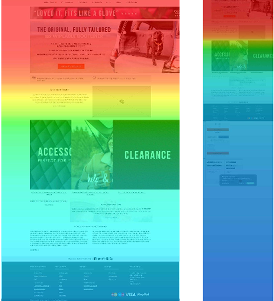
Heatmap Key Insights
- Navigation elements showed almost no interaction (as low as 0.2% desktop).
- Homepage engagement focused almost entirely on “Find my vehicle” (9–14%).
- Scroll depth was very low, with only 8–12% of users reaching the bottom.
- Category pages showed heavy reliance on “Select a vehicle” (over 30% of clicks).
- Mobile users depended on the hamburger menu (up to 5.7% taps), revealing poor prioritisation of key actions.

Comparative UX Benchmarking
To validate the configurator challenge, I analysed similar product selectors within the boot-liner and pet-protection market. Industry standards showed shorter (3–5 step) flows, persistent vehicle selection, clearer labels and faster navigation.
Content & Vocabulary Audit
Copy and labels were inconsistent, lengthy and unclear that were causing users to misunderstand options, miss key details, and struggle to recognise which product they were actually selecting.
Wireframes
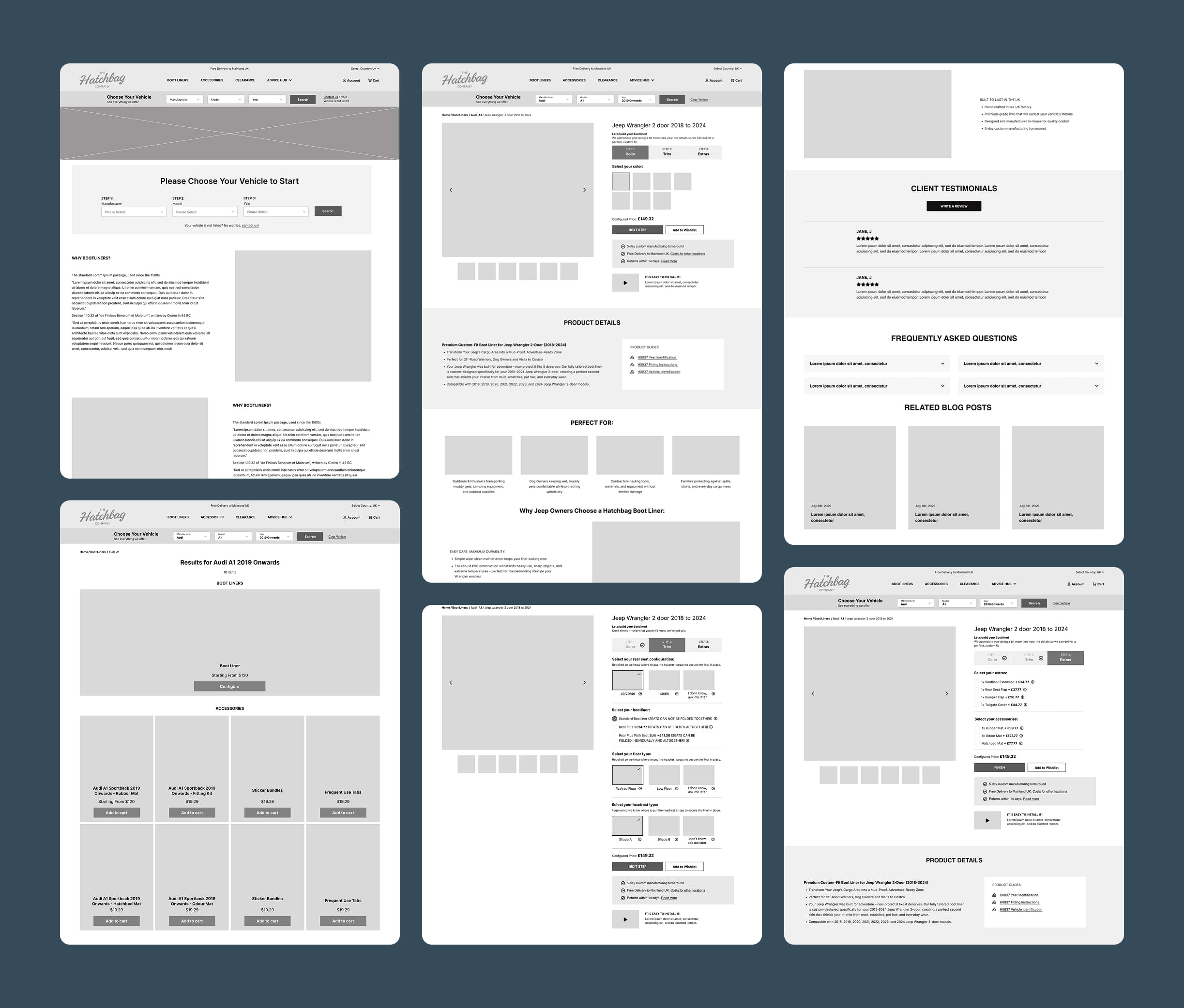
I started with a small set of wireframes to confirm the logic of the new 3-step configurator, the PDP modules, improved navigation and the updated information architecture.
I kept it focused only on the interactions that needed structural changes which gave the team clarity on the flow before any visual decisions were made.
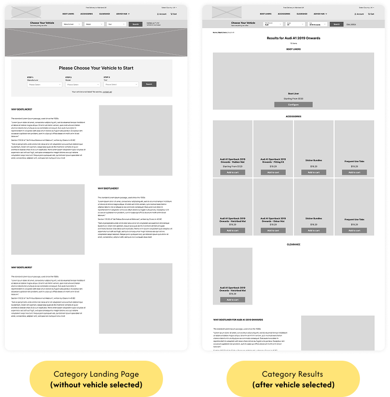
Vehicle Selection & Category Navigation
- Introduced a persistent Vehicle Selector in the header to replace confusing dropdowns and modals
- After selecting a vehicle, users land on a dedicated results page filtered specifically for their car
- Users stay within this filtered environment across all categories (Boot Liners, Accessories, Clearance)
- Implemented a single flexible template across categories, reducing development time and complexity
Product Configurator
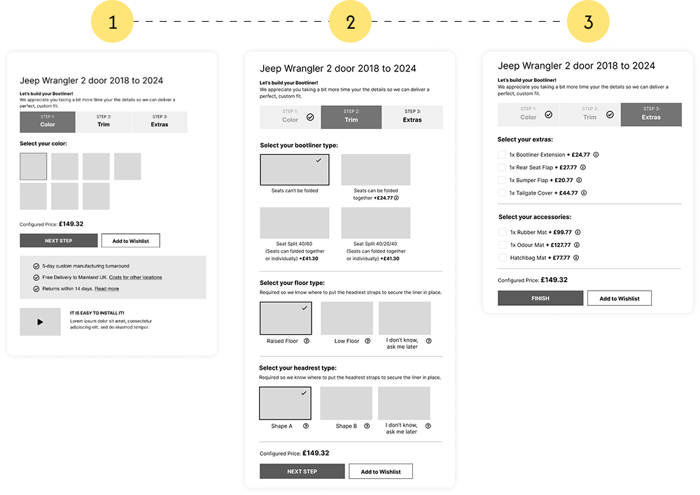
- Previous 8-step configurator reduced to 3 simple steps placed inside tabs (big structural change)
- Removed complex and overly technical questions that caused confusion
Product Page Restructuring
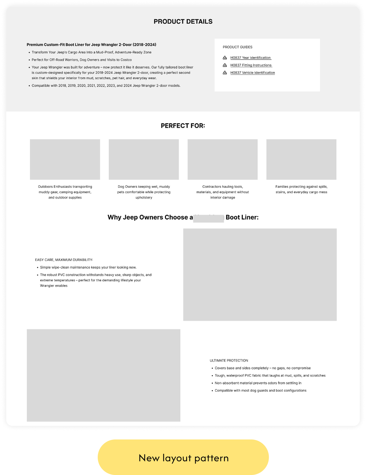
Alongside the configurator, I restructured the entire PDP to give users the information they were missing before:
- Defined the core information hierarchy for the PDP
- Structured the page into clear, modular sections
- Ensured product purpose and benefits appear early in the flow
- Added placeholders for specs, testimonials, FAQs and related posts
- Created a layout that can scale across different vehicle models
UI Design System Foundations
SCALABLE INTERFACE
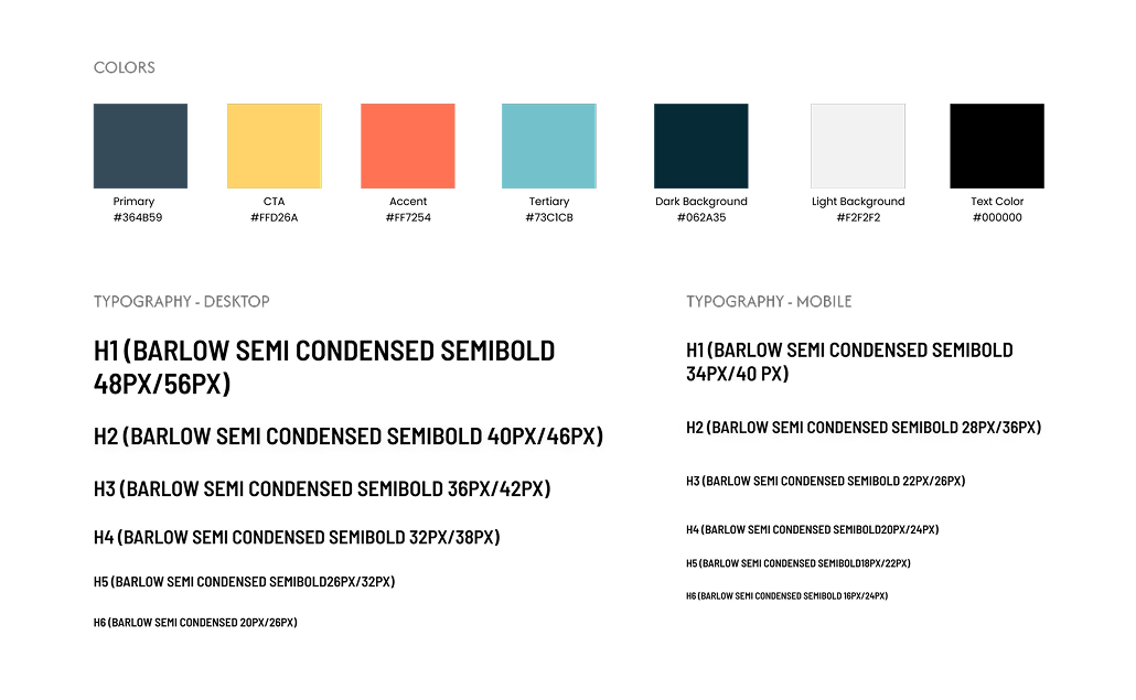
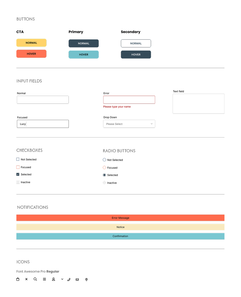
To support the redesigned experience, I created a lightweight UI system that defined the visual foundations for the project. The goal was to keep the interface consistent, scalable, and easy for developers to implement.
UNIFIED LOOK
The system included:
- an updated color palette with clear functional roles
- a responsive typography scale for desktop and mobile
- standardized components such as buttons, inputs, checkboxes and radios
- defined interaction states (hover, focus, error)
- consistent notification styles and iconography
This gave the entire interface a unified look and made development faster and more predictable.
ADA COMPLIANT
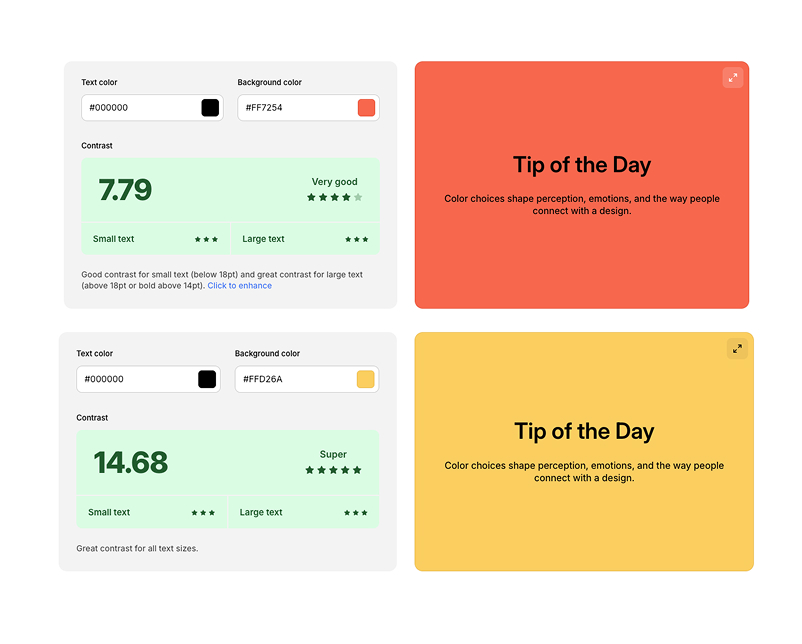
All colors in the UI system were tested to meet AAA-level ADA contrast standards, ensuring maximum readability and accessibility across the entire interface.
Visual Design
HOMEPAGE
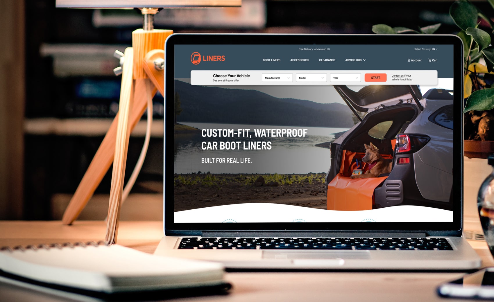
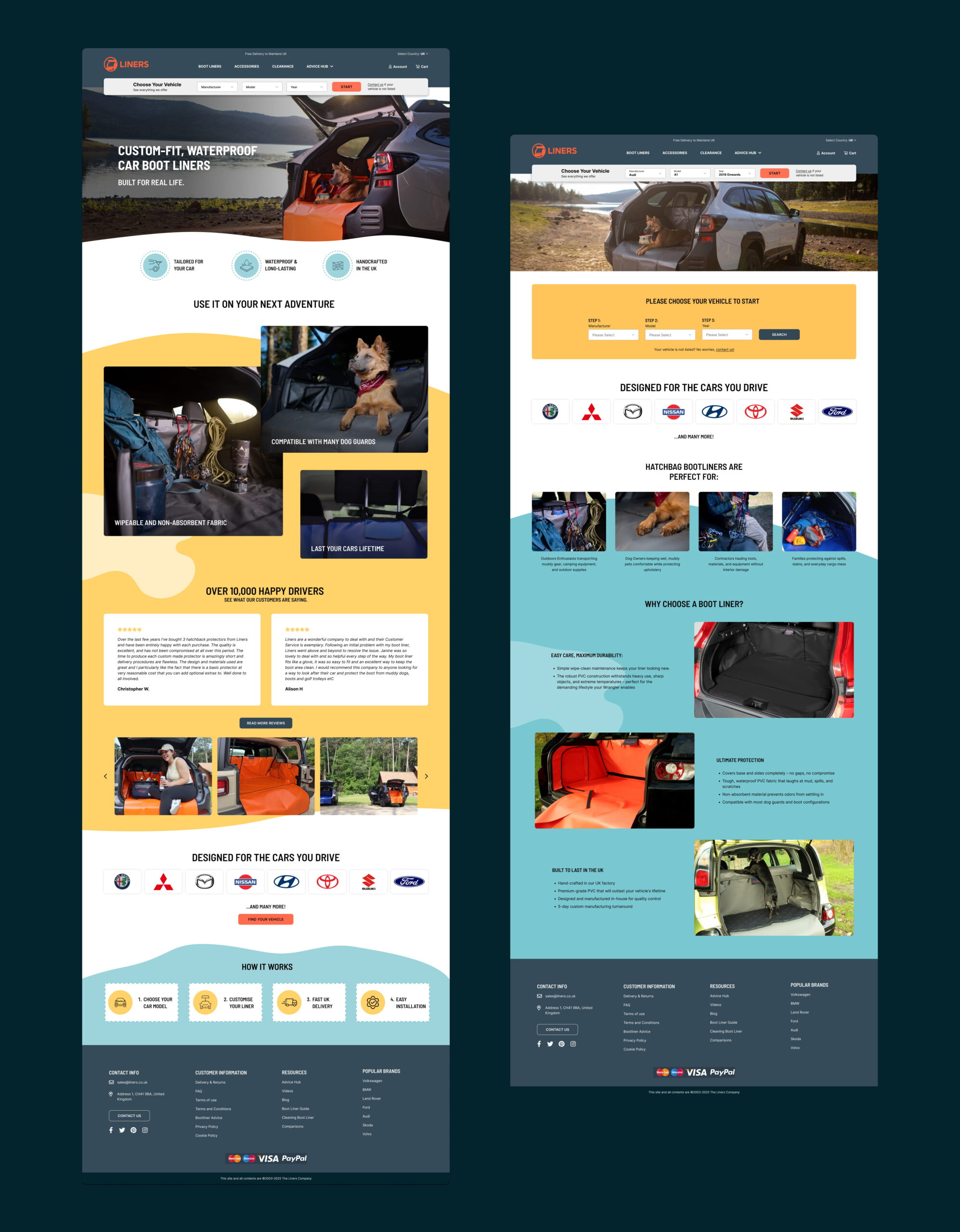
The refreshed homepage introduces a brighter, friendlier visual style designed to resonate with the brand’s core audience. Combined with a clearer hierarchy, real-life imagery, trust elements and a prominent vehicle selector, the new layout feels more human, more intuitive, and more conversion-ready.

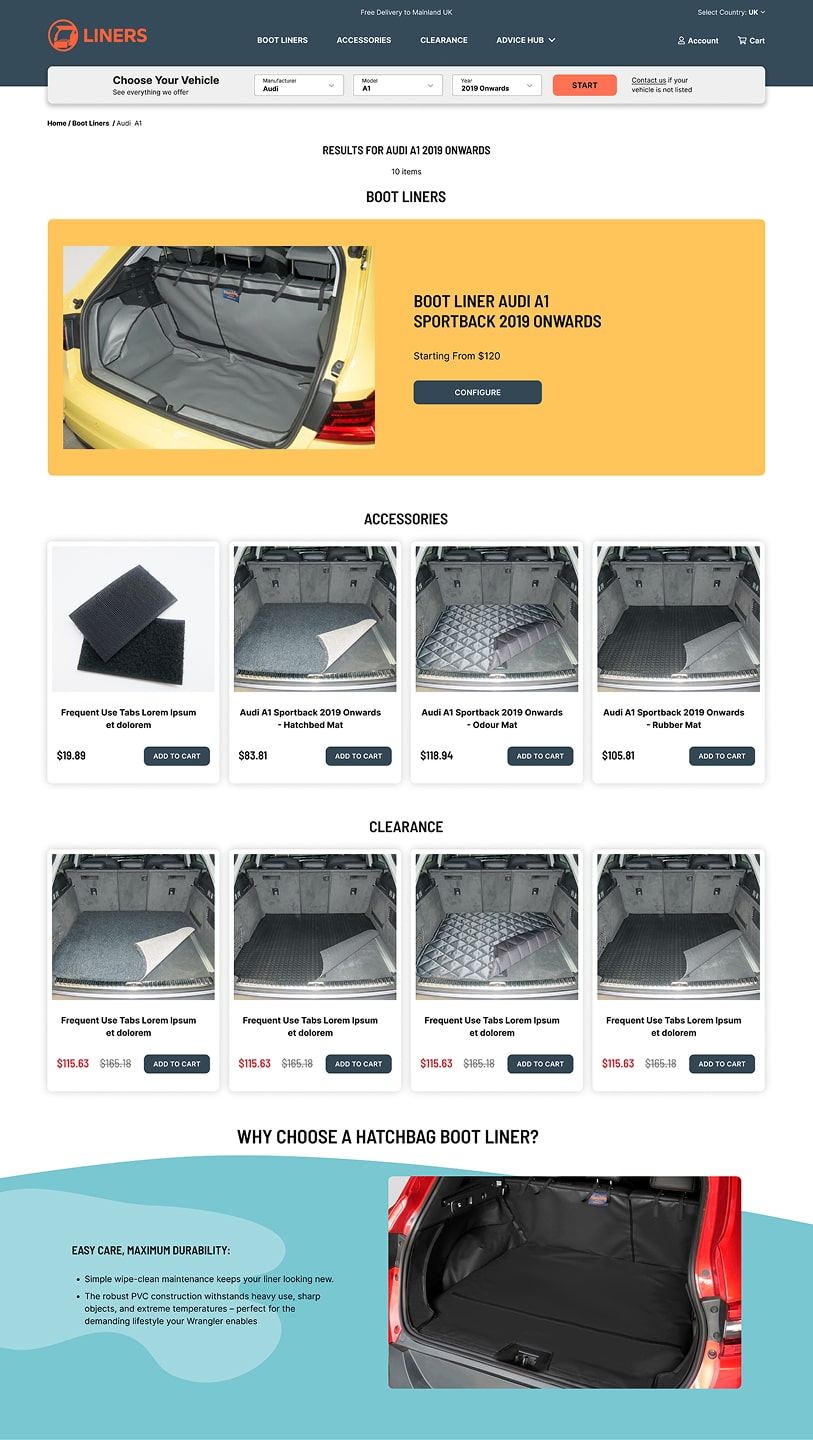
CATEGORY PAGE RESULTS
- I created a clean, modular layout where all three product types (Boot Liners, Accessories, Clearance) sit in one place, removing the old fragmented flows.
- The page introduces a single, consistent visual rhythm (spacing, typography, image ratios) to reduce cognitive load and help users quickly understand what’s available for their selected vehicle.
- Supporting content blocks (“Why Bootliners?”, trust cues, guides) are reorganized beneath the product grid to ensure the primary path stays focused and conversion-driven.
PRODUCT PAGE
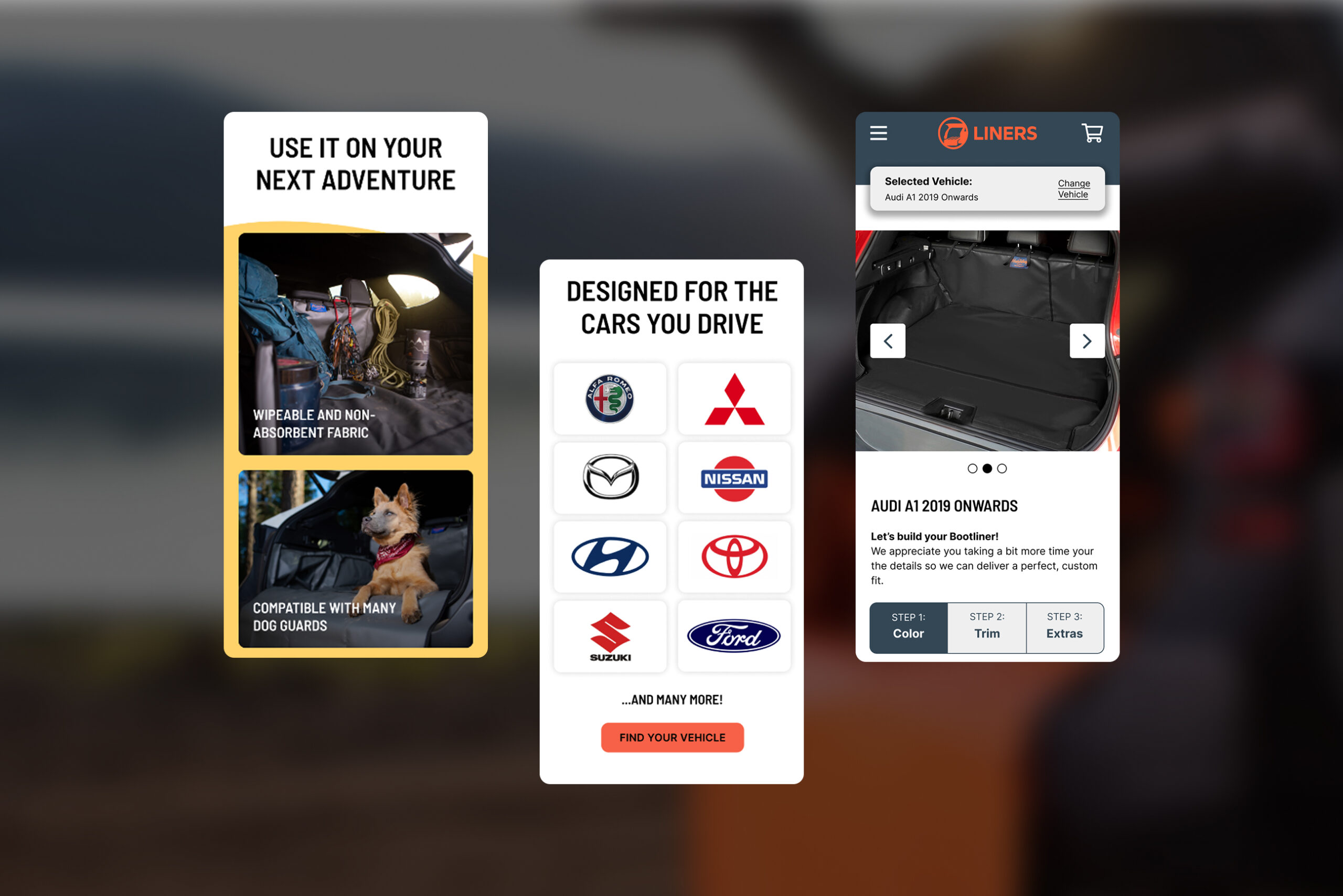
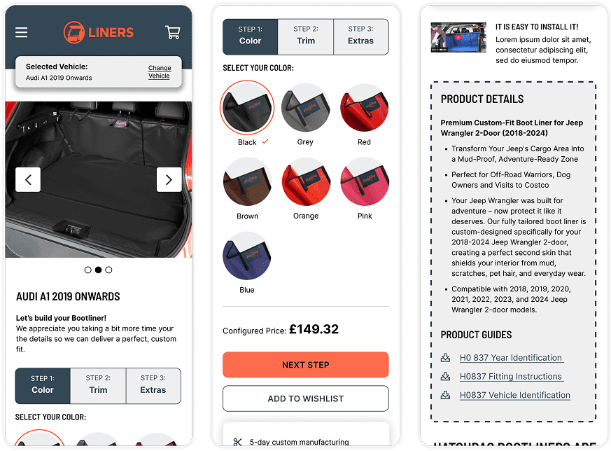
Redesigned the configurator from 8 steps down to 3 simple, intuitive stages.
Removed repeated inputs, clarified confusing options, added visual cues, and kept vehicle selection persistent. The flow is now faster, clearer, and significantly easier to complete.
Redesigned PDP for Simplicity & Clarity
The product page was redesigned to improve clarity and reduce the cognitive load users previously experienced. I introduced a cleaner visual hierarchy, reorganised content into scannable sections, and improved image presentation so users can better understand what they’re buying.
Key details like benefits, and materials are now easier to find, while trust indicators and clear CTAs support faster decisions and reduce uncertainty.
Building Trust Through Content
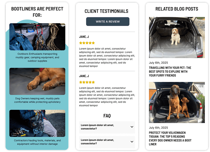
To strengthen user trust and reduce hesitation on the PDP, I expanded the page with several credibility-driven content sections.
Customer testimonials were introduced to provide real-world proof and reinforce product quality, while related blog posts were added to support decision-making with educational, SEO-friendly content.
NAVIGATION MOBILE
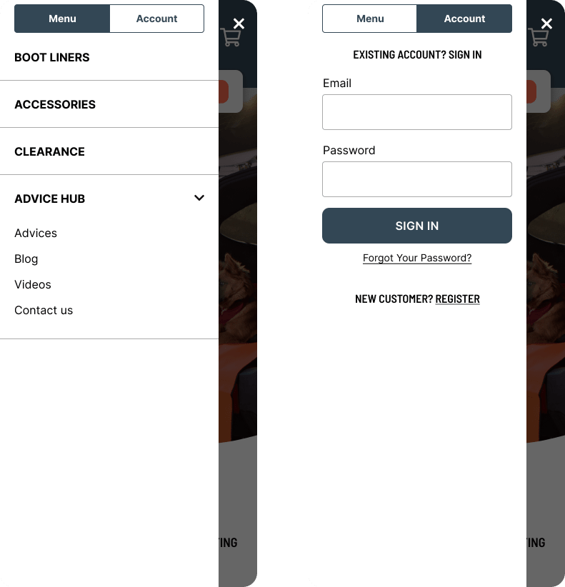
The mobile navigation was restructured to make key actions faster and easier to reach. The cart is now always visible in the header instead of hidden inside the hamburger menu, reducing the interaction cost from two taps to one.
Primary categories were simplified, labels clarified, and spacing improved for easier scanning. These changes help users move through the site with more confidence and eliminate unnecessary friction in the buying journey.
Results
- Add to Cart Rate increased 88%
- Conversion Rate increased 60%
- Reduced the configurator from 8 steps to 3, eliminating repeated decisions
- Unified all product categories into one clear, predictable flow
- Improved PDP clarity with better hierarchy, visuals and terminology
- Modernised the UI and strengthened accessibility (contrast, spacing, readability)
- Simplified mobile navigation by surfacing key actions
- Created a scalable structure that also supports vehicle-specific SEO

NDA & Confidentiality Notice
This case study is a re-interpretation of my work completed at Human Element.
All sensitive information, client names, pricing, internal processes, and proprietary assets have been removed, altered, or anonymised to comply with NDA restrictions. The visuals, flows, and UI shown here are recreated for demonstration purposes only and do not represent confidential or unpublished client materials.
