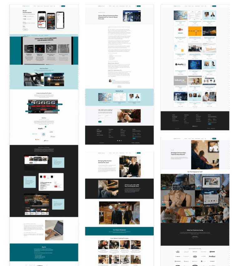
Roush Performance migrated from Magento to Shopify on an out-of-the-box theme. The site worked, but it didn’t represent the brand.
Before any design work began, I ran a full UX/UI audit – and everything that followed was a direct response to what it found.
MY ROLE INCLUDED:
Lead UX/UI Designer
Full UX/UI Audit
UI Kit
Homepage
Vehicle Page
Mega Menu
Blog Landing & Blog Post
Podcast Page
TEAM:
Development, Marketing, Project Manager
The redesign has not yet launched. All screens shown are design deliverables pending development. Work created as part of my role at Human Element.
KEY ISSUES
Problems the audit
made impossible to ignore.
Typography that undermined the brand
The largest heading on the site was 24px. Two near-identical sans-serif fonts added page weight without adding anything visually. Bebas Neue already existed in Roush brand guidelines but wasn’t being used on web.
Impact: The site read as generic. Nothing communicated premium.
ADA failures throughout
Contrast ratios as low as 2.51 on key UI elements. Font sizes below 14px on interactive controls. Cookie bar text illegible against its own background. For a precision-focused performance brand, accessibility failures were a credibility problem.
Impact: The site failed basic compliance standards across multiple touchpoints.
A homepage that buried the brand
Five image sections with identical layouts. Text overlaid directly on imagery. A featured products grid of eight items from a catalog of thousands. Three separate brand story sections that said nothing memorable.
Impact: Strong imagery and a strong brand story – neither came through.
CONSTRAINTS
Designing within what
was actually possible.
Shopify theme limitations
The redesign had to work within Shopify theme architecture – less custom development, more working with what the theme could support. Every design decision accounted for what was realistically buildable without a full custom build.
Brand elevation, not replacement
Roush has strong brand assets – great photography, clear brand colours, racing heritage. The brief wasn’t to rebrand. It was to let what they already had actually show up properly on screen.
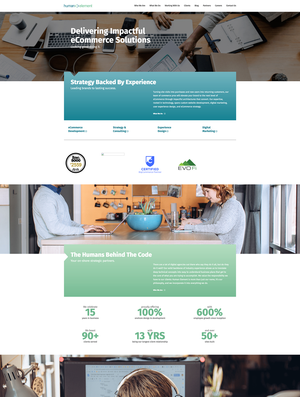
RESEARCH
Starting with questions, not solutions
Platform research
Several WordPress builders were evaluated before any design work began. Elementor Pro was selected for its visual editor, global styles support, and the ability for a non-technical team to maintain it independently.
Behavior Data
Heatmaps, session recordings, and GA pointed to the same issues: high bounce rate on the homepage, low scroll depth, and significant mobile traffic on a site not optimized for it. These findings shaped the content hierarchy and page prioritization.
Competitive Analysis
A review of competitor agency sites showed where Human Element’s positioning had fallen behind visually and in terms of content. Key gaps: outdated service framing, missing platform partnerships, and a lack of social proof on entry pages.
Stakeholder Interviews
Conversations with leadership shaped the content strategy and service positioning. These sessions clarified which audiences the site needed to speak to, which services to lead with, and how the agency wanted to be perceived by prospective clients.
DESIGN
From concept to build
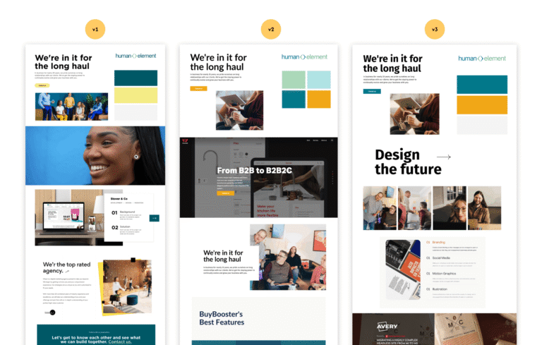
Mood boards & visual direction
Mood boards were used to align the team before any screens were designed.
The goal was to modernize the existing palette and elevate the overall feel, without losing brand recognition.
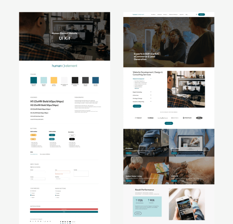
Homepage & UI kit in Figma
The homepage and UI kit were designed in Figma to establish the full visual system before development began.
Typography scale, color roles, spacing, and core components all defined here. Key pages with complex layouts followed in Figma as well.
Remaining pages built directly in Elementor
The majority of pages were built directly in Elementor.
With the global styles and component library set up upfront, visual consistency held throughout without needing a Figma file for every page.
BEFORE & AFTER
The visual gap tells the story.
BeforeAfter
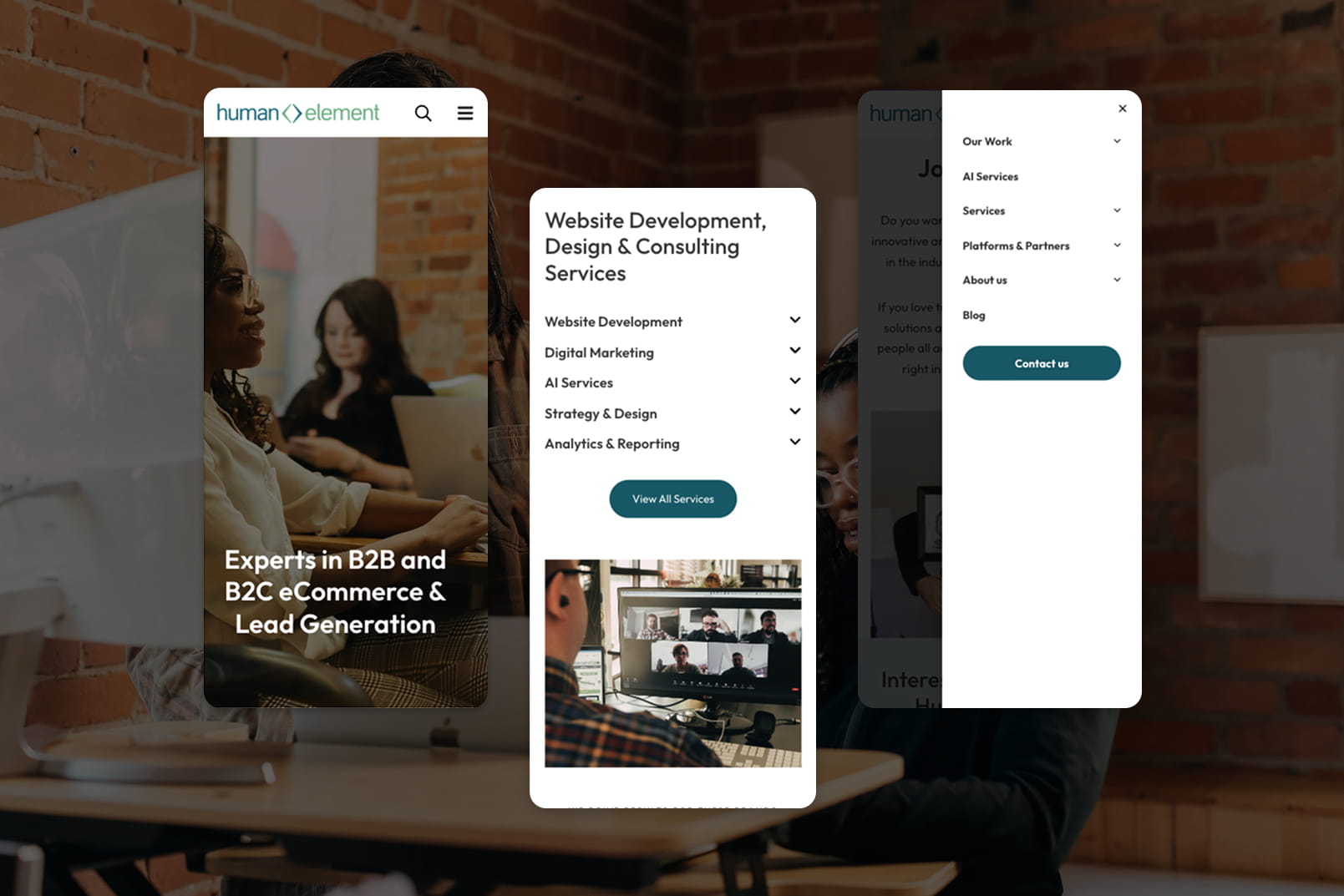
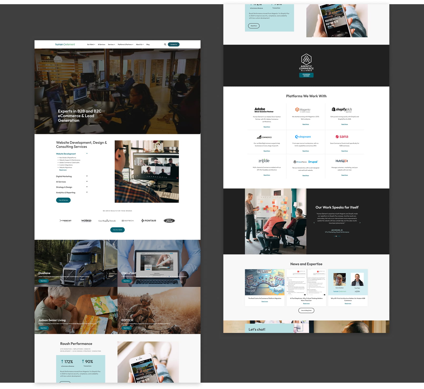
HOMEPAGE
Before:
Significant ADA issues throughout: poor contrast, inaccessible typography, no keyboard navigation
Background gradients applied as uncompressed images, increasing page load time
Services, platforms and case studies absent from the homepage entirely
After:
Video hero introduced to immediately communicate agency scope and energy
Full services structure visible on homepage with sub-service drill-down
Case studies surfaced as primary content, not buried
Visual identity elevated to match the agency’s positioning
BeforeAfter
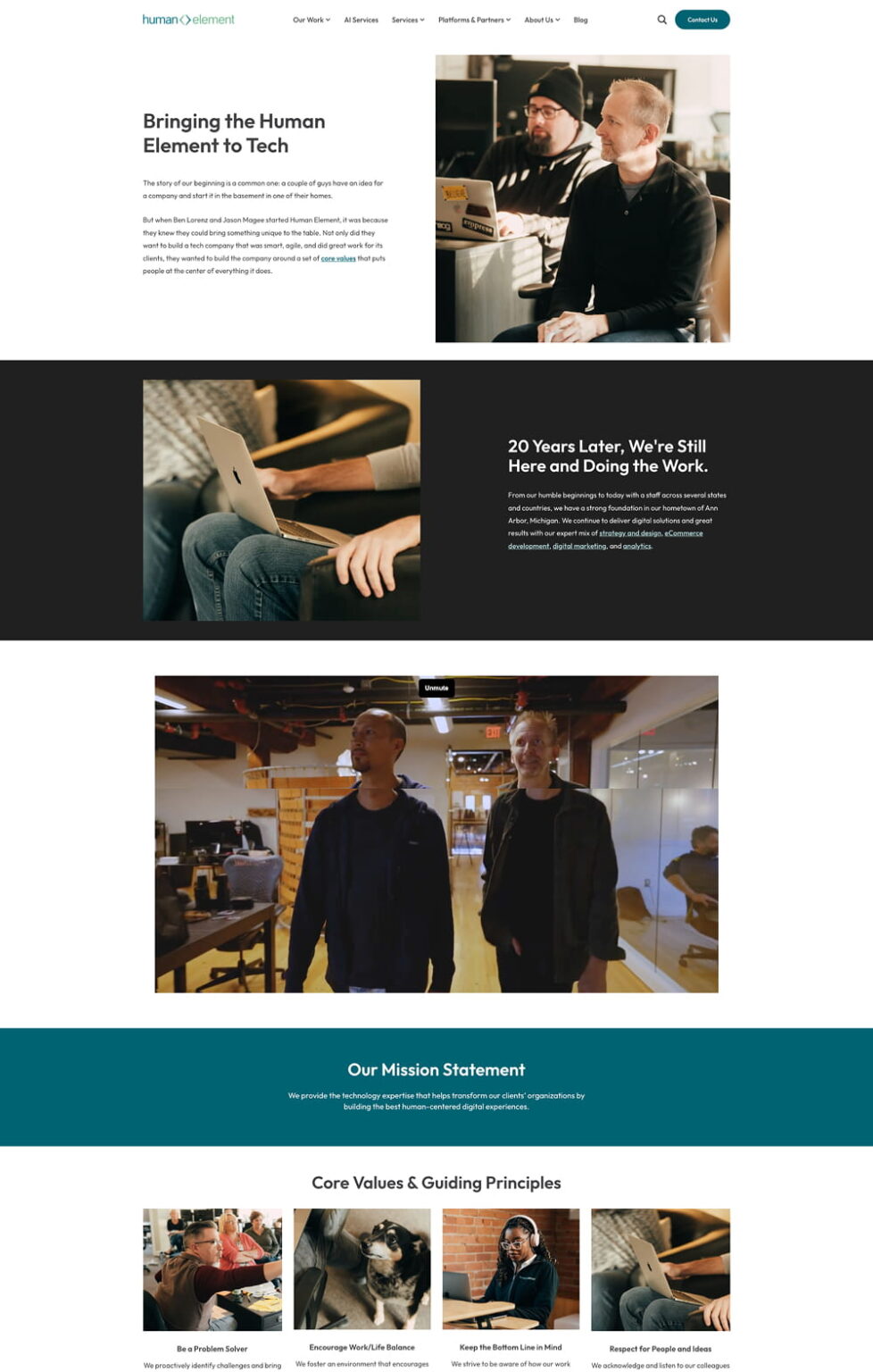
ABOUT PAGE
Before:
Single text block on a pastel background
No team presence, no brand personality, no visual structure.
No sense of who the agency actually is.
After:
Full narrative with team photography, company story in sections, mission statement, core values grid.
A page that actually introduces the people behind the agency.
RESULTS
A site that finally matches the agency behind it.
What was delivered
Full site redesigned and rebuilt, 40+ pages delivered
Migrated from an unreliable Avada build to a stable, scalable Elementor Pro system
All services, platforms and case studies now accurately represented on the site
ADA compliance issues resolved across the board: contrast, typography, keyboard navigation
Global design system established, with color, type, and spacing managed from a single source
Internal team can now create and edit pages independently, without design or developer support
Blog readability improved with a new typographic scale, cleaner layout, and related posts
Visual identity elevated to reflect Human Element’s positioning as a premium eCommerce agency
New platforms and AI services section added, accurately representing the full service offering
NDA & CONFIDENTIALITY NOTICE
This case study is a re-interpretation of my work completed at Human Element. All sensitive information, client names, pricing, internal processes, and proprietary assets have been removed, altered, or anonymised to comply with NDA restrictions. The visuals, flows, and UI shown here are recreated for demonstration purposes only and do not represent confidential or unpublished client materials.